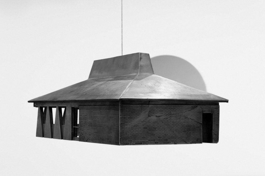
Eric Wesley: ISOSCELES TRAPEZOID ARCH
Review I by Sara Cluggish
Midway Contemporary Art
Sept 10–Oct 22, 2016


Eric Wesley has a penchant for Euclidean geometry and fast food restaurants. His recent exhibition at Midway Contemporary Art combines these interests in an abstracted series of glass sculptures and two small-scale, yet detailed, bronze replicas – one of a Taco Bell and the other of a Pizza Hut. Trying to understand the logic of Wesley’s exhibition is like talking to a friend who pursues a PhD on Hegelian dialectics during the day and binge watches reality television at night. Most of us know at least one person like this, and upon first introduction, it can be hard to square the two seemingly incongruent aspects of their personality. Initially, the minimal, austere show offers few clues to decode its meaning. However, the more time spent with the glass and bronze sculptures on view, the more Wesley’s deadpan humor and cultural commentary is opened up and brought to the fore.
The exhibition’s title ISOSCELES TRAPEZOID ARCH suggests an absurd, puzzling mathematical impossibility. A four-sided isosceles trapezoid is essentially a pyramid with a flat top, while an arch is rounded – how can one shape inhabit both properties simultaneously? The answer lies in a complex year-long project Wesley is undertaking in the Cahokia neighborhood of St. Louis. From May 2016 to April 2017, the artist, with the support of his commercial gallery Bortolami, has taken up residence in a disused, strip mall Taco Bell, transforming it into a gallery and studio space. It is here that he looks through the arched windows of his Taco Bell residence-cum-art gallery to the trapezoidal windows of the Pizza Hut across the street.
Taco Bell is a company with roots in California, Wesley’s home state. The chain’s global success is largely attributed to two things: its innovative hard shell taco and the restaurant’s recognizable buildings that riff on California’s ubiquitous Mission Revival architecture – a style in turn derived from the religious, colonial outposts of Franciscan priests in the southwest from 1769 – 1833. Consider this in relation to the history of Cahokia, St. Louis, which was founded as a French Canadian Mission even earlier in 1696. Wesley’s fascination with Taco Bell – which could initially be cast off as an utterly kooky artistic gesture – reveals a nesting doll of cultural associations. For many in the Midwest, Taco Bell is just another fast food eatery produced by the anonymous, globalizing thrust of capitalism, but for someone who comes from the southwest or for an individual with indigenous heritage, the restaurant’s architecture might be a reminder of systematic cultural erasure.
La Belle (2016) is a small-scale, bronze replica of a Taco Bell. Wesley has translated the building’s cheap, mass-produced wood, stucco, brick and clay-tiled roof into bronze, the most permanent of materials. Its title can be misread as “The Bell” or translated from French as “The Beautiful” which the structure, arguably, is not. In addition to linguistically referencing Cahokia’s French Canadian colonialist history, this title is akin to a tongue-incheek mispronunciation of the Minneapolis-based corporation Target with a fake French accent as Tar-Jay. A similarly cast bronze sculpture of a Pizza Hut is positioned opposite La Belle in an echo of the Cahokia, St. Louis neighborhood and countless neighborhoods across the country. The two restaurants commonly appear together as both are owned by the same Fortune 500 company, Yum! Brands, Inc. In recent years, the company has reconfigured the establishments as co-locations set within Target stores, theme parks, truck stops and airports worldwide. This cafeteria-style pairing forces each fast food chain to abandon their commonplace architectural identities, and the old standalone eateries now exist as Chinese restaurants, liquor stores, pawn shops, gospel churches and funeral homes. The bronze replicas of ISOSCELES TRAPEZOID ARCH subtly point to the changing status of these re-purposed structures. The sculptures are complete with intentional, detailed cracks running along faux-brickwork, while luminous logos meant to attract restaurant patrons are omitted from the façades of each. Wesley’s sculptures are not cast in the likeness of pristine, newly constructed buildings but appear as darkly humored monuments to the golden age of 1980’s fast food dining.
Replacement Windows #1-4 (all 2016) are hung one to a single wall of the gallery. The thin geometric glass panes are treated with translucent film in soft hues of blue, magenta, and smoked grey. The highly polished, reflective surfaces recall the Finish Fetish aesthetic of 1960-70s Californian Minimalism, most potently Larry Bell’s color-tinged glass cubes. Unlike Larry Bell’s sculptures however, there is no volume to these works. The socalled ‘windows’ press flat and firm against the gallery’s walls and are less window-like and more so mirrors that reflect the content of the exhibition and its visitors inward. The dimensions of each glass pane correlate to the exact size and shape of the restaurant architecture from which they depart. Standing at certain angles, two Replacement Windows positioned opposite each other line up, creating an infinitely regressive hall of mirrors. As a child, I distinctly remember the feeling of seeing my image reflected between two such mirrors. With so many versions of myself on each side it gave the sensation of time suspended, as if standing between my past and my future. Eric Wesley’s exhibition is comparable to this illusion. Using strategies of abstraction and memorialization, he focuses in on one specific place, one pair of restaurants, one microcosm of the country and time travels.
