Caroline Kent: Joyful is the Dark
Review by Kelsey King
Public Functionary
Jun 25–Jul 23, 2016
Caroline Kent’s show at Public Functionary titled Joyful is the Dark reveals a personal language of abstraction that is imbedded in Kent’s identity as an artist, writer, curator, mother, and woman of color. There is a sense of accessibility throughout the exhibition, which at first seems inherently backwards when one is faced with reading a room full of abstract paintings. However, Joyful is the Dark functions cohesively as a body of work created within one visual vocabulary. Symbols form relationships with other symbols, gestures reference other marks, and all of this abstract language is read as a narrative, one that can actually be translated into words. There is a femininity in her work’s approachable nature, as opposed to the inaccessibility often felt when viewing historically masculine abstract paintings. There is a warmth in the readability of her work. There is a power in allowing the viewer to engage with her visual language while also remaining inherently abstract, which I found to be the most compelling aspect of Joyful is the Dark.
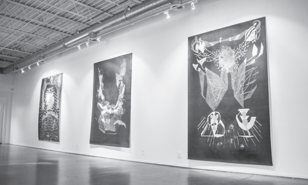
The majority of the exhibition consists of five large, 6’ x 9’ paintings. Public Functionary has proved to be extremely malleable in the way that the space transforms for each of its diverse programs. The layout of Joyful is the Dark elegantly displays Caroline Kent’s work —there is enough space for the works to exist as separate entities but to also come together as one interconnected body.
Caroline Kent’s black paintings carry weight. Her dual identity as a mother and woman of color challenges abstraction by bringing a radical voice to the conversation. I’m left thinking of Jack Whitten’s solo exhibition at the Walker Art Center, a black painter also working in abstraction who has created his own language of figures and characters that come through again and again in his work. While his paintings aren’t directly political, they act as an identity for Whitten much as Kent’s language of abstraction produces her own visual identity.
Most of the gestures and symbols that sit atop the black ground in these paintings act as a bright contrast, with well-defined edges forming clear-cut shapes. Other marks, often producing a pattern, fade into a middle ground with their muted intensity of application. Kent’s paintings initially loom over the viewer—they have the ability to intimidate in their size and darkness. However, after spending time with the works they start to emit a feeling of comfort in their nearness to compositional symmetry and the familiarity of the characters that compose Kent’s abstract language. The symmetry in some of her large paintings even verges on the making of a Rorschach test, adding to the sense of readability and translation between visually abstract and written language.
Beyond the large paintings is a collection of works on paper held in a vitrine against the furthest wall. Each work displays a small composition or figure with a short caption, as if Kent is putting a name to the figure, connecting these two seemingly unrelated languages. Unlike many painters who try to write, or writers who try to paint, Kent can easily and effectively shift between the two. With lines like, “I saw a man who looked like you, sat like you, dare I say he even drank his coffee like you. I’m inclined to think that we are all performing one another—one big circus of imitation,” Kent writes directly, without frills. Her captions verge on a narrative while still remaining somewhat enigmatic, similar to her paintings.
Caroline Kent’s work is strong and inherently feminine. The light, swooping gestures in Further and Farther Than One Expects suggest the sensation of cradling, creating a space for the viewer to enter and fall against. A number of her works, such as Dinner Party, feel compositionally similar to a womb, in the way that they form circular shapes encompassing a majority of the canvas. The oval-like figures connected by a series of lines that frame the edge of the painting in It’s Like Magic are reminiscent of ovaries or Fallopian tubes. The vibrant colors in these compositions are full of life—they ignite a movement throughout the canvas.
Abstract painting has been a white male-dominated field. History has produced a mountain of abstract paintings against white-grounded canvases with broad strokes and figures that are endowed a meaning beyond the viewer’s knowledge. The viewer is made to think that there is something to understand about these abstract paintings that is out of their reach. Caroline Kent’s body of work provides an alternative language – one that is personal, inviting, decipherable, joyful. Rather than isolating her audience, Kent gives us words and visuals to embrace. Joyful is the Dark offers pleasure in viewing where there often isn’t.